Getting your name out into the world can be the biggest hurdle for a new or even an established business. There are a lot of ways to get exposure, and one of the most important ways is with your business card.
A business card tells someone who you are, what you’re about, shows your logo or motto, and gives information about how to contact you. A well-done custom business card presents your business and yourself in a positive and professional way, unlike many other things can. There are countless ways to design and lay out your business card, but one crucial element for any card is the size.
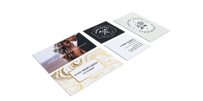
What is the Standard Business Card Size?
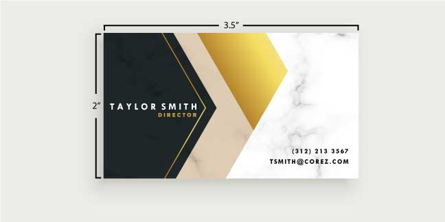
The standard business card size is 3.5” x 2” (3.5 inches wide by 2 inches tall). The most common measurement is done in inches, but 3.5 x 2 inches can also be translated into 8.89 cm x 5.08 cm, 88.9 mm x 50.8 mm, or 336 pixels x 192 pixels.
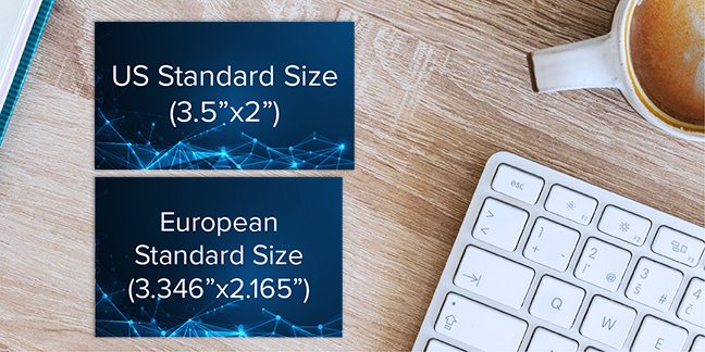
European vs US Standard Business Card Sizing
Although there is a standard size in the US, standard business card sizes vary by region. In the UK and Western European areas, business cards are a bit more square at 3.346” x 2.165” (85 mm x 55 mm). In Australia, a standard business card is 3.543” x 2.165” (90 mm x 55 mm).
Layout for Business Cards
With the standard size of 3.5” x 2” in mind, there are three areas of the business card to consider; the design area, the margin area, and the bleed area. The design area is where you’ll have your text, photos, and other design elements. The margin area, sometimes called the safe or inner margin area, is where main design elements should end, and the bleed area (the point outside of the actual business card that allows colors near the edge to bleed over, providing full color along the edges of the card) is what will be cut off when your card is finished. The standard file size for a business card with bleed area is 3.75” x 2.25” (0.25” larger in width and height than the finished business card), so you’ll want to set your design to that size to begin with.
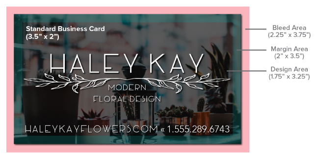
Think about your design elements and how you’d like them to appear. If you want your design to go to the very edge of the card, it can extend into the bleed area, but keep in mind that anything within the bleed area (which is beyond the trim line) will be cut off. To be safe, we recommend keeping all pertinent information within the design area. One thing to note is that the design tool found on our Signs.com website does not show the bleed area by default. To see the bleed area, go to the “Advanced Tools” section in the design tool and click on “show bleed area”.
Another thing to note when setting up your business card is the font size you should use. Choose a font that is unique but still easy to read. Usually, 7 to 11 point fonts (.09 to .15 inches tall, respectively) work the best for readability. Be sure you choose a font that is easy to read in a small size, and don’t overdo it with graphics and words. Sometimes less is more.
Horizontal or Vertical? Which Orientation Is Best for Your Business Card
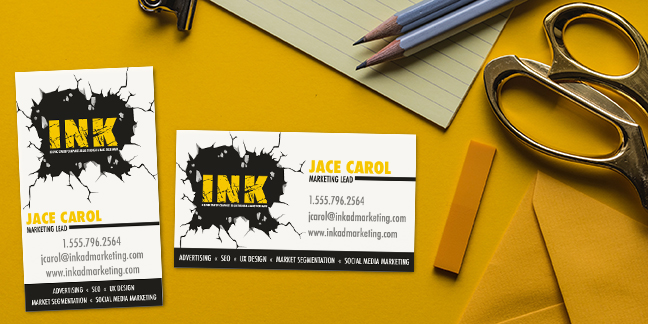
Horizontal orientation refers to your card reading wider than it is tall, sometimes referred to as landscape orientation. The benefit of using a horizontal layout is that this is a standard layout, so it’s easy to read and recognize quickly. However, one thing to note is that it doesn’t particularly stand out. Vertical orientation is when your card reads taller than wider, known more commonly as portrait layout. The advantage of this layout is that it’s a bit different than the norm and can make your business card stand out in a world full of business cards.
Additional Shapes and Sizes
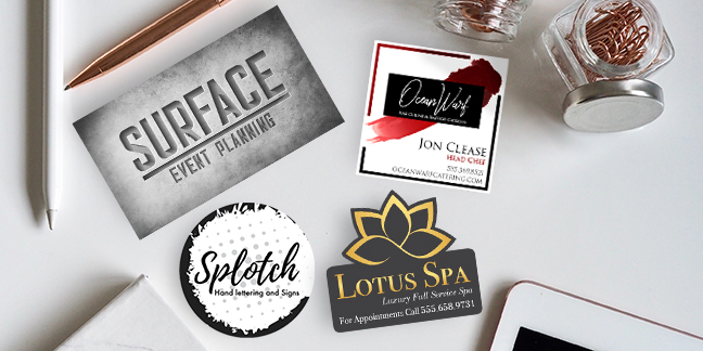
The standard 3.5” x 2” rectangular business card is not your only option when it comes to shape and size. You can get a custom cut shape, also called die cut, while still staying within the standard size. You can also round the corners of your card or play with other shapes such as circles (frequently sized at 3” x 3”) or squares (frequently sized at 2” x 2”). Keep in mind that with any sort of shape customization, you’ll most likely see a price jump. Just like using different orientations, using an uncommon shape or size has both advantages and disadvantages. The advantage is that the shape is unique and eye catching, and you can cater to your business logo or product. The disadvantage is that a unique shape might not get recognized as a business card and could be easily discarded or overlooked. For example, a square or circle business card could be mistaken for a tag or label and tossed out. These types of cards also might not fit in business card binders, clips, or other card carrying cases.
Common Materials and Thicknesses for Business Cards
Business cards are a chance for you to be creative. The most common type of paper used to create business cards is 16pt cardstock, with 14pt and 32pt being used frequently as well. There are even more types of paper used to create business cards, and here is a list of the most common types of business cards with their corresponding thicknesses:
- 100lb Cover – 0.35mm thick (.014 inches)
- 14pt – 0.39mm thick (.012 inches)
- 16pt – 0.41mm thick (.016 inches)
- 18pt – 0.46mm thick (.018 inches)
- 32pt – 0.81mm thick (.032 inches)
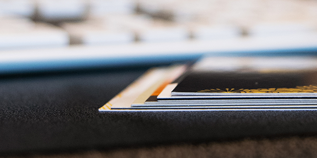
Although these are the most commonly used types of paper, cards can go even thicker (up to 48pt, which is nearly the thickness of a penny). Most people stick with 16pt stock, as it is a sturdy option at a great price point. If you want something even more outside the box, you could look into business cards made from wood, plastic, cork, metal, or other similar materials. These options are definitely sure to stand out, but you’ll want to make sure the price point is worth it.
Business Card Finishes
Another thing to note when considering the thickness of your business cards is whether they are using any special finishes or coatings, as it will be sure to add to the thickness of the card. There are many options for finishes and coatings, but the most common are gloss, matte, spot UV, embossed, and foiling. More specialized finishes include pearl, luster, silk, suede and velvet. Make sure that your finish works well with the design and wording on your card. For example, you probably wouldn’t want to add superfine spot UV to a 100lb linen paper type because of conflicting texture issues. There are also other finishing options for the physical aspect, like die cut, folded, and double-sided cards. Even in our digital age, business cards are useful and relevant. You can say a lot about yourself or your business with a small paper card, so be creative and come up with something extraordinary. Brainstorm ideas that will set your business apart from the rest of the crowd. Signs.com offers many options for custom, innovative business cards. Click here to get started on your own custom business card.
From https://ift.tt/2H0fTCQ, find us on maps: https://bit.ly/31tHUKW
No comments:
Post a Comment